IDEA GENERATION
Having formed a concept which has had a positive response from peers through critique, it became clear that there were many elements to consider. Breaking it down through these design sheets so that the idea is fully explored, looking at methods, content, and message so that the constructed idea

Initial ideas, forming the title/name of the product, its distribution, its form and function.
Looking at;
- Layout/grid
- stock
- colours
- inspirations / influences
- online / analog
- social media
- imagery
- type
- size
- format
- visuals
- Production
- Cost
- style
Conclusions -
Title - Anarchy / AnarchyUK (instagram) / AnarchyNowUK (Twitter)
Format - Online content - Physical and digital ad campaign promoting this content
Distribution - Screenprint/monoprint posters posted onto walls and on poster boards - online social media ad campaign with 'hashtag' Anarchy
Content - Typography (titles, subheadings, social media accounts), photographs (Relevant clear imagery), information (descriptions, explanations) Clear bold messages being put through ad campaign to explain what anarchy is and to make people want to look into it more.
Production - Monoprint/screenprint. Digital renderings. Animated gifs. Keeping the style constant throughout the designs.
Considerations - stock (yellow/off white influenced by anarchy publication covers) looking at newspaper print and other cheap yet effective materials which can work printed onto walls as well as get interesting texture and style through to digital design (Online posters, gifs, animations)

Looking at how the ideals and politics of anarchy can be visualised and explored through posters to reach out to a new generation of people with anarchistic ideas or political views. Looking at popular imagery related to anarchy and anarchism ideas and culture, symbols like the black flag, the CND peace logo, and the fist logo of solidarity and anarchy. Thinking of the ideas anarchism is really about; Peace, freedom, equal, education, direct action.
Conclusion - The symbols can be misleading and represent other things as well as anarchy, an interesting route may be pure typography posters, a tactic often used by designer Rufus Segar in his work.
Considering all typographic posters and no imagery being used at all would produce an interesting take, if done properly it can show the values of anarchy and also show influences of both Rufus Segars cover designs and styles used during the 1984/5 miners strikes.
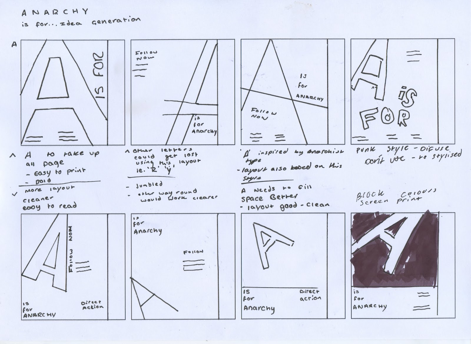
Conclusions - considering a number of styles which can and have represented anarchism, it was clear that a sans-serif typeface would be the most appropriate, and a typeface such as Helvetica, Din or Akzidenz Grotesk would show relevance through it being the three main type choices of anarchy and common typefaces in anarchist and political propaganda. Using the 'A' which is a common symbol within anarchism to represent the word also, a cleaner simple layout for the information means the form of the 'A' can be interpreted uniquely and represent anarchy and the content in a more relevant way (Colour, Layout)

Thinking further about the form of the 'A' and how it can be represented, previously looking at poster design and how things can be represented, an effective idea would be creating an anarchist alphabet, each letter to explain an anarchist ideal or cause. Trying to break down an idea/cause for each letter proved difficult, with some not having any description to represent them, though this idea was to diffuse and over complicated a simpler more effective concept would be to use the alphabet idea on just the word 'Anarchy' this would then form series of posters and gifs for social media.
No comments:
Post a Comment